The Design Process
Our Kitchen Plans
The design process is easily where we spent the most time…nine months to be exact. It was a long process and what I discovered in that nine months is that Dan and I are extremely indecisive and at the same time very detail oriented. This combination is hilarious.

We frequently suffered from information overload. Having too many options can be a good thing for sure, but when you are type-A like Dan and I, our need to evaluate everything can often lead to analysis paralysis. The reality is, we’ve never tackled a project of this magnitude with so many moving parts and there were a lot of decisions, each one affecting another. This opportunity to create the kitchen of our dreams was both daunting and exciting and we were determined not to screw it up. Our budget was pretty tight. We couldn’t afford mistakes or regret, so we spent hours on Pinterest and Houzz.com considering options and comparing styles…and then changing our minds only to start the process over again.
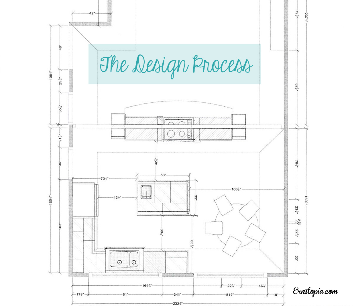
As designers, Dan and I are both visual people. Seeing some initial designs of the kitchen laid out on paper was extremely gratifying and helpful to get our heads around the big picture. What really got us excited was spending a few hours touring the 2012 Street of Dreams model homes in search of some real life examples of what we wanted in our kitchen.
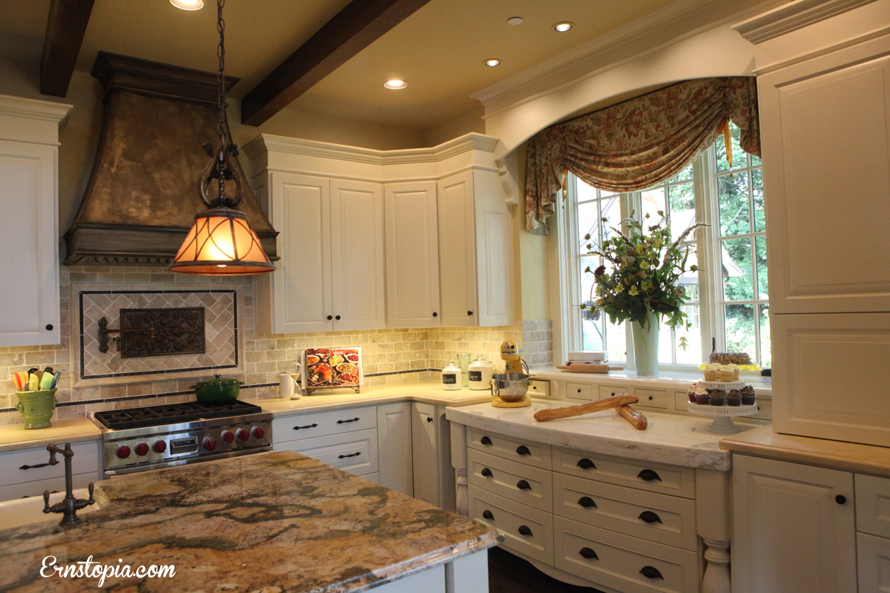
This kitchen was my favorite, hands down. The colors were just what I wanted for our home. I loved the way the drawers looked like a piece of furniture and I loved the turned legs on either side of the drawers. I also drew inspiration from the colors in the back splash and the granite counter top. There is a baking center hidden in the large cabinet to the far right which houses the Kitchen-Aid mixer and baking supplies. What you don’t see in this picture is the moment when I was trying to test out the heavy-duty mixer pop-up lift system and I totally jammed it so it wouldn’t collapse back into the cupboard. Guess who no longer wants that lift system in her kitchen?
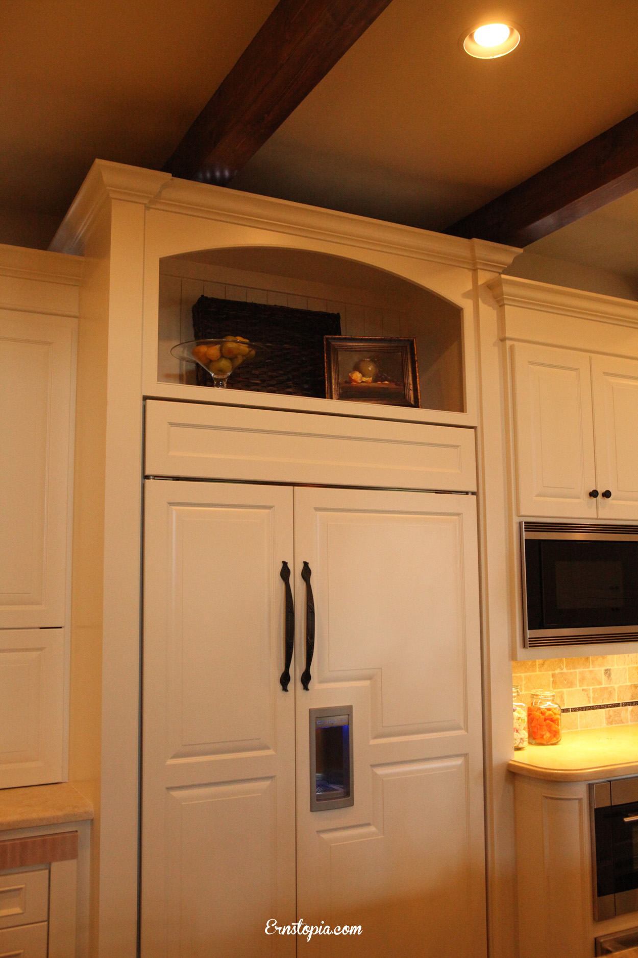
The area above the refrigerator is something I was wrestling with. Typically it’s used for storage, but it’s so awkward to reach without standing on a chair, so I considered using it for a display area instead. I often choose form over function and this example sealed the deal.
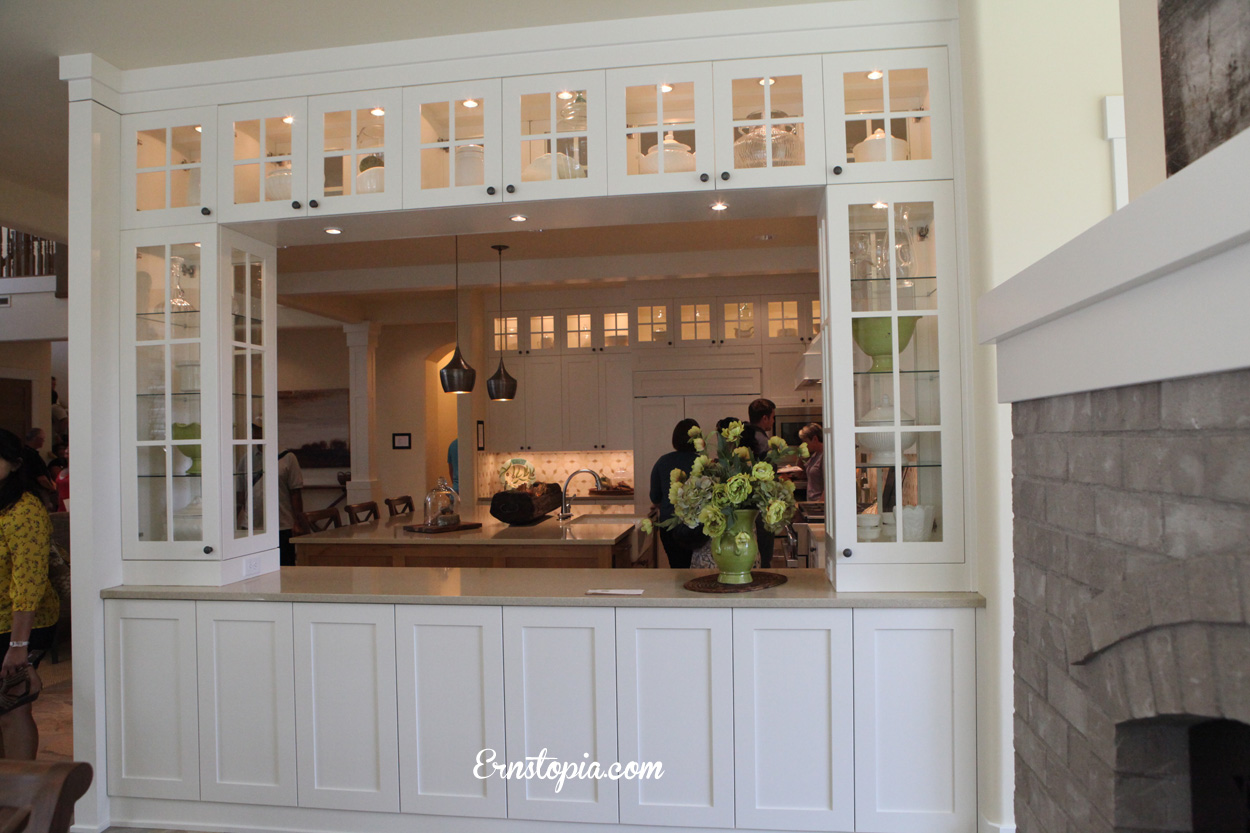
Our plans included narrow cabinets on either side of the stove top and while this example gives the structure we were looking for, we both agreed that having everything in our cabinets on display would be a disaster.
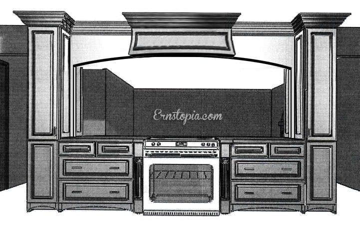
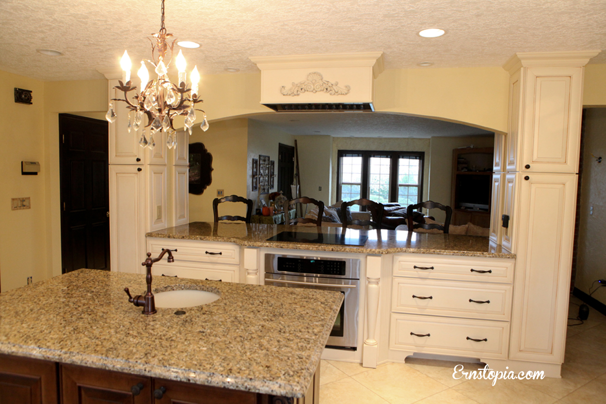
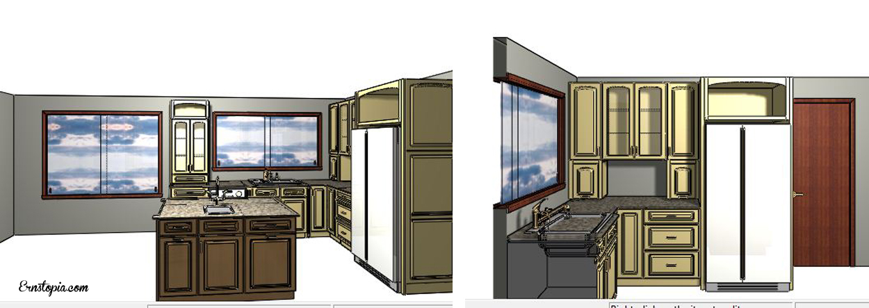
Touring the kitchens at the Street of Dreams proved to be both fun and helpful. We used our photos to help convey the details we liked in order to pin down cabinets and finishing materials. We brought our ideas to Phil, the cabinet expert extraordinaire at Lowes, who became our new BFF for the next year. He was so patient with us. After problem solving our complicated venting and oven issues, he came up with these design for us and we were so excited to see just a glimpse of how our kitchen would look. Keep in mind, at this point our kitchen is completely gutted, no dry wall, no appliances, no counters or cupboards, so anytime we got a glimpse, it kept us optimistic that the end truly was in sight…even though it was a long way off!
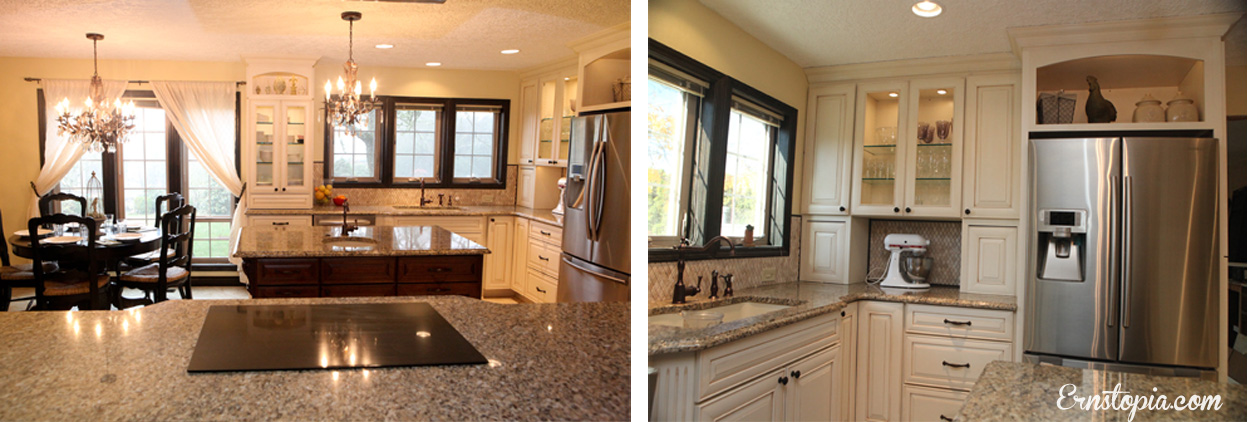
I love looking at these images side by side. Our dream kitchen in real life…finally! As you can see my Kitchen-Aid mixer has a lovely little resting spot on my counter tucked away, a much better solution for someone who obviously can’t handle the pop-up lift!
